Last January I started a series asking questions about type sizing & spacing on the web.
Uncategorized
2
Posts
1
Posters
6
Views
-
Last January I started a series asking questions about type sizing & spacing on the web. When web.dev asked me to write about the current state of fluid type, I came prepared with graphs. I hope this is a helpful TL;DR for thinking about responsive type in #CSS:
-
Last January I started a series asking questions about type sizing & spacing on the web. When web.dev asked me to write about the current state of fluid type, I came prepared with graphs. I hope this is a helpful TL;DR for thinking about responsive type in #CSS:
Some key points:
- The viewport size is an unreliable narrator
- The more type is responsive to the viewport, the less responsive it is to user inputs
- That's true using either media queries or viewport units
- If you do it, keep it minimal, and clamped by user settings
- Test test test -
 undefined oblomov@sociale.network shared this topic on
Feed RSS
Gli ultimi otto messaggi ricevuti dalla Federazione
-
Current* conditions near Chicago, IL:
-
L’esperienza di Greenham Common. La dirompente pratica dell’antimilitarismo femminista
@anarchia
Il 5 settembre 1981, l’arrivo di una piccola delegazione di donne gallesi ai cancelli della base aerea della Royal Air Force (RAF) a Greenham Common non sembrava destinato a riscrivere la storia dei movimenti sociali del ventesimo secolo. Eppure, quella...
-
Trail through it all
#FootpathFriday #nature #rainforest #ForestFriday #Mosstodon #hiking
-
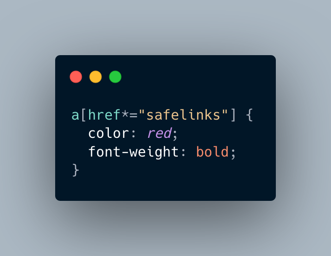
@khleedril @eniko "now you have two problems" 🤣
-
Current* conditions near Cleveland, OH:
-
Current* conditions near Duluth, MN:
-
@superblox
@eniko
Half shitpost/half earnestpost:
But what about in Zig?
-
Dopo due cene con noi sarà lui a chiederci di uscire!
