i don't... hate... this?
Uncategorized
73
Posts
37
Posters
0
Views
-
@disorderlyf having both creates vertical streaking artifacts though
@eniko Could be they're less visible at the pixel density I'm viewing from
-
-
RE: https://mastodon.gamedev.place/@eniko/116036378192057724
i don't... hate... this?
like it's crumnchy. but is it too crumnchy? 🤔
(full color left, 8 bit color + dither on right)
@eniko oh this looks delicious
-
@Texan_Reverend whoa that looks so cool!
-
And now that I have a structured palette I know what bits are red, green, and blue, and so I can easily do cool effects using PUTs binary operations, OR, AND, and XOR
Fuck yeah this is going so well!
i added a 0-1 scalar that biases colors towards non-dithered to make things less busy. here's factors 0, 0.25, 0.5, and 0.75 in order:
-
i added a 0-1 scalar that biases colors towards non-dithered to make things less busy. here's factors 0, 0.25, 0.5, and 0.75 in order:
@eniko This dithering looks gorgeous.
-
@mcc I guess I could weight towards the pure colors? Might try that tomorrow and see how that works
@mcc what do you think of this? https://mastodon.gamedev.place/@eniko/116040108035560003
-
i added a 0-1 scalar that biases colors towards non-dithered to make things less busy. here's factors 0, 0.25, 0.5, and 0.75 in order:
@eniko reactions
AAAAA
oh
hmm?
blort -
@eniko reactions
AAAAA
oh
hmm?
blort@MachineLordZero is hmm? good
-
@MachineLordZero is hmm? good
@eniko it's more go back and check before, does this one feel better or does that one
*optometrist voice* 1, or 2? 1, or 2? -
i added a 0-1 scalar that biases colors towards non-dithered to make things less busy. here's factors 0, 0.25, 0.5, and 0.75 in order:
@eniko without my glasses, at full screen and brightness and with my (OLED) phone at 30 cms from my face, I'd say .25 looks better
With my glasses on and my phone as I usually use it, I'd say .5
On any other screen I'm honestly not so sure, but the sweetspot seems to be arround there
-
i added a 0-1 scalar that biases colors towards non-dithered to make things less busy. here's factors 0, 0.25, 0.5, and 0.75 in order:
@eniko What is it about lowres dithered images that make you feel right at home and nostalgic?
They feel like a good book that provides a mental image with just the right amount of description and let your imagination fill in the details.
I like the .5 and .75 biased ones.
-
-
i added a 0-1 scalar that biases colors towards non-dithered to make things less busy. here's factors 0, 0.25, 0.5, and 0.75 in order:
@eniko Nice. The 1:2 pixel aspect pleasantly reminds me of the Amiga's "Medium-Res". 💚
-
@Texan_Reverend whoa that looks so cool!
@eniko @Texan_Reverend Keep in mind that even on pretty bad CRT monitors, the picture would look much closer to what it looks like on LCDs than on CRT TVs. VGA monitors were not that bad.
-
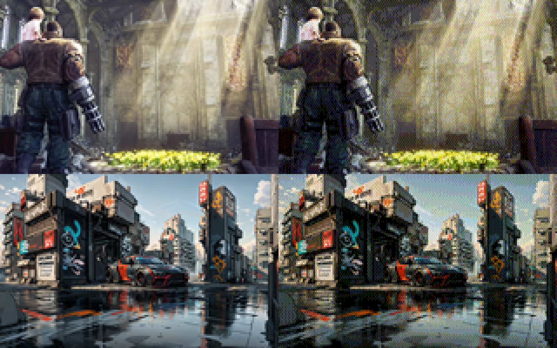
i added a 0-1 scalar that biases colors towards non-dithered to make things less busy. here's factors 0, 0.25, 0.5, and 0.75 in order:
what's shocking me the most is that images with a lot of blues in it still work really well, despite only having 2 bits of blue (so 0, 85, 170, and 255)
-
what's shocking me the most is that images with a lot of blues in it still work really well, despite only having 2 bits of blue (so 0, 85, 170, and 255)
@eniko I still can’t believe how readable those images are at such a low resolution.
-
what's shocking me the most is that images with a lot of blues in it still work really well, despite only having 2 bits of blue (so 0, 85, 170, and 255)
@eniko I think this is because what makes blue so evocative is how much of other colors it has in it. Cool vs warm blues...
-
what's shocking me the most is that images with a lot of blues in it still work really well, despite only having 2 bits of blue (so 0, 85, 170, and 255)
ok i found this utility by @Mattias_G https://mattiasgustavsson.itch.io/crtview and i'm going to take a shortcut
expect some more pretty images shortly >_>
Feed RSS
Gli ultimi otto messaggi ricevuti dalla Federazione
-
-
@giuliocavalli Avete già dimenticato? La premier anni fa querelò un attore di stand up comedy, Daniele Fabbri, che in uno sketch la definì "puzzona", e la sorella querelò Natangelo per una vignetta sul marito (il Ministro Lollobrigida, che combatteva la sostituzione "etnica"). Ma ora invocano la libertà di satira di Pucci. Che non è stato cacciato, ha lasciato l'incarico di sua volontà. Avrebbe potuto rifarsi una reputazione con un bel monologo all'Ariston, ma forse si era già preparato...
-
fino al 28 marzo hanno tempo di infiltrare per askatasuna...
-
"Se deve essera liberta drespressione, deve esserci per tutti, non solo per chi ci piace"
Le parole di Paola Ceccantoni (in rete Pubble) durante il suo intervento nel corso di "Urto", con Giulio Cavalli, dopo il Caso Pucci-Sanremo e le parole della Premier Meloni.
(Dal lunedì al venerdì, dalle 11 alle 12 e poi in podcast su Spotify)
-
Venezuela: petrolio, sovranità e la pistola americana sul tavolo
https://www.kulturjam.it/news/venezuela-petrolio-sovranita-e-la-pistola-americana-sul-tavolo/
-
Sketch di 10 minuti matita e inchiostro aspettando mia figlia in macchina.
Con le proporzioni ho decisamente toppato, ma chi non gioca non impara.Da una reference di Grafit Studio
#10minutessketch #art #sketch #nudeart #nakedart #pencilandink
-
@LordCaramac i don't know if i can to be honest. i don't know how you interface with a midi device in DOS, let alone from qbasic
-
@eniko Can you add some Roland MIDI music support as well? I still have a fully functional Roland CM32L (fully backwards compatible successor to the MT32, but without any display or controls, just a grey box).
