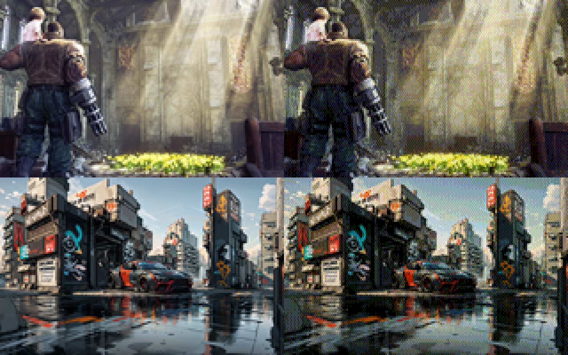
i don't... hate... this?
-
i added a 0-1 scalar that biases colors towards non-dithered to make things less busy. here's factors 0, 0.25, 0.5, and 0.75 in order:
@eniko I like the last one best - multiple scales in the same image, adds visual interest.
-
@spinach i've considered switching to a different color space than RGB but keeping things RGB has some benefits for this engine because i can only really do "blending" effects with bitwise tricks, and that's a lot easier to do in RGB
@eniko so here's the other side of that trick. if you use a YCbCr format, you can apply all of your blending tricks to only the Y plane, and that's usually enough to get most of the idea across
-
-
@eniko so here's the other side of that trick. if you use a YCbCr format, you can apply all of your blending tricks to only the Y plane, and that's usually enough to get most of the idea across
@spinach how would you distribute the bits for that though?
-
@eniko @Texan_Reverend Keep in mind that even on pretty bad CRT monitors, the picture would look much closer to what it looks like on LCDs than on CRT TVs. VGA monitors were not that bad.
@jernej__s @eniko I'm well aware.
However, dithering gets considerably smoothed on consumer CRT TVs using composite connections - which helped consoles like the PS1 make acceptable use of it. So, I thought it would be neat to see how these retro-styled images looked in that context. -
what's shocking me the most is that images with a lot of blues in it still work really well, despite only having 2 bits of blue (so 0, 85, 170, and 255)
Well, your eye is least sensitive to blue, so you need a bigger difference in blue brightness to sense the same change you see with smaller differences in red or green. Back in the day, that's why we often used an eight-bit palette with 3 red, 3 green, and 2 blue bits.
Some of this is addressed here: https://www.2020mag.com/article/a-brief-look-at-the-theory-of-color-perception#:~:text=If%20the%20wavelengths%20of%20light,Source:%20deron.meranda.us
-
ok i found this utility by @Mattias_G https://mattiasgustavsson.itch.io/crtview and i'm going to take a shortcut
expect some more pretty images shortly >_>
oh and here's our old friend the color test parrot
-
oh and here's our old friend the color test parrot
@eniko hello color test parrot
-
 undefined oblomov@sociale.network shared this topic
-
oh and here's our old friend the color test parrot
@eniko Parroty error
-
what's shocking me the most is that images with a lot of blues in it still work really well, despite only having 2 bits of blue (so 0, 85, 170, and 255)
@eniko TBF some of those blues have plenty of other colors in them 8-D

