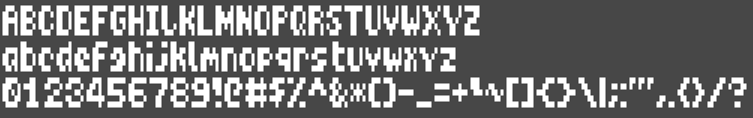
created my 320x100 font for my qbasic experiments.
Uncategorized
24
Posts
14
Posters
37
Views
-
@eniko is there a reason for the symetry with the V letter?
@gkrnours it looked wonky when it wasn't symmetric
-
How do you separate (adress) each character in your program?
I see 'i' is shorter than 'm' for example. (or do I look at it badly and it is same size?)I've done some development for embedded devices, but we had mono space fonts most of the time. (each character had same size)
So it was possible do something like starting_point(character - 'A') and I've got possition of character in bitmap.@FandaSin every glyph just has its own array of memory
-
created my 320x100 font for my qbasic experiments. i'm fairly pleased with it
@eniko I love It!! blocky and personal, it gives me Teletext vibes.
-
@eniko I love It!! blocky and personal, it gives me Teletext vibes.
@somepx i consider that high praise coming from you :D thanks!
-
lets pretend nobody saw the J is flipped horizontally for no reason i can discern
this would get an 853 character density if i packed characters as close as possible. but it's variable width, so it's probably more than that in practice
monospace DOS 320x200 fits 1000 characters
pico 8 fits 683
seems like a happy medium?
if i pack them less densely it goes down to 731 or 640 which is still fine
-
@FandaSin every glyph just has its own array of memory
Oh. Nice!
Thank you for enlightening me.👍 -
lets pretend nobody saw the J is flipped horizontally for no reason i can discern
@eniko That's what し said. LOL
-
@ratsnakegames @eniko well I just thought they sound almost if not quite at all alike =)
-
@ratsnakegames @eniko well I just thought they sound almost if not quite at all alike =)
@korpiq ... yes, they do, because じ is a derivative of し, just like ä is a derivative of a
-
created my 320x100 font for my qbasic experiments. i'm fairly pleased with it
@eniko RELEASE THE FONT FILES!!!
-
 undefined oblomov@sociale.network shared this topic on
Gli ultimi otto messaggi ricevuti dalla Federazione
-
Referendum giustizia: “100 voci per il no”. dieci ore di diretta dalla casa internazionale delle donne di roma
@anarchia
A due settimane dal referendum, Anpi e Articolo21 organizzano una maratona radio, tv e social. Si parte alle 10.00 di venerdì 6 marzo e si andrà avanti fino alle 20.00 in diretta dalla Casa Internazionale delle
-
-
Quizzino della domenica: Cinque bambini
@matematica - Riuscite a ricavare le età dei bambini?
-
@faraiwe @glyph Yeah at this point I have to assume that if you choose to work for Oracle, you’re aware of the possible/likely personal outcomes.
-
@glyph The most interesting to me is that Oracle’s shifting to a “BYOC” model where their customers have to pay for the hardware build-out to get the capex off of Oracle’s books. How popular do you reckon that’s going to be?
-
@glyph let the techbros hit the floor.
-
@azonenberg I was just thinking how when you burn a CD, the appearance of the data side changes for the part where you wrote something. like the worlds most affordable diffraction grating pattern, perhaps
-
AI can help students learn … if it pushes them to think instead of handing over answers. In a classroom experiment, students using an AI tutor that asked guiding questions scored higher on exams. https://theconversation.com/we-designed-an-ai-tutor-that-helps-college-students-reason-rather-than-give-them-answers-276584