Could anything be more naff than a script typewriter font?
-
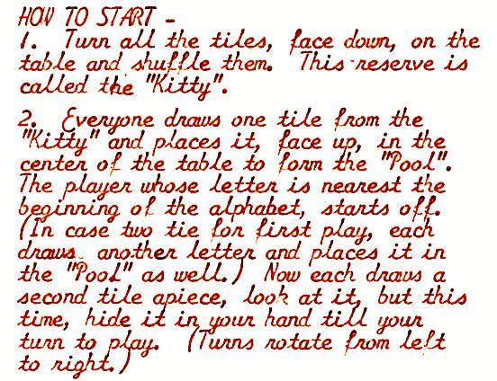
Could anything be more naff than a script typewriter font? Combines the illegibility of cursive with the forced fixed character spacing of a typewriter.
(and good luck trying to OCR this mess)
-
Could anything be more naff than a script typewriter font? Combines the illegibility of cursive with the forced fixed character spacing of a typewriter.
(and good luck trying to OCR this mess)
@scruss I had an Olivetti that typed like that. I think I scanned stuff from it years ago. 🤔
-
Could anything be more naff than a script typewriter font? Combines the illegibility of cursive with the forced fixed character spacing of a typewriter.
(and good luck trying to OCR this mess)
@scruss my mother ordered a script font for her beloved Selectric and used only that the rest of her life 😊
-
Could anything be more naff than a script typewriter font? Combines the illegibility of cursive with the forced fixed character spacing of a typewriter.
(and good luck trying to OCR this mess)
Well, it was the 70s
-
Could anything be more naff than a script typewriter font? Combines the illegibility of cursive with the forced fixed character spacing of a typewriter.
(and good luck trying to OCR this mess)
@scruss Did they sell the game with this instruction sheet, or is this something that someone typed up and stuck in the box?
-
Could anything be more naff than a script typewriter font? Combines the illegibility of cursive with the forced fixed character spacing of a typewriter.
(and good luck trying to OCR this mess)
@scruss I know of a good proportionally spaced typewriter font. Matthew Butterick’s Triplicate is a delight; in my eyes, at least.
-
Could anything be more naff than a script typewriter font? Combines the illegibility of cursive with the forced fixed character spacing of a typewriter.
(and good luck trying to OCR this mess)
@scruss aw, i love them so much
-
@scruss aw, i love them so much
@rose_alibi well, someone had to
-
@rose_alibi well, someone had to
@scruss they're incredibly popular in the lab, all of our changeable font machines inevitably end up with the scrip wheels back in them
-
@scruss Did they sell the game with this instruction sheet, or is this something that someone typed up and stuck in the box?
@ranjit I assume it was sold with the game. It's an 8×10″ sheet that was in the game box (S&R's "Scrabble® Anagrams", 1962) that I got at a thrift store. The box lid also includes instructions, which don't exactly match this text and have a couple of contradictory rules.
S&R sold Anagrams at least into the early 1970s, but I'd never heard of it. The 180 wooden letter tiles are extremely pleasing.
-
@scruss they're incredibly popular in the lab, all of our changeable font machines inevitably end up with the scrip wheels back in them
@rose_alibi your lab members show impeccably bad taste, then
-
Could anything be more naff than a script typewriter font? Combines the illegibility of cursive with the forced fixed character spacing of a typewriter.
(and good luck trying to OCR this mess)
@scruss So satisfying
-
Could anything be more naff than a script typewriter font? Combines the illegibility of cursive with the forced fixed character spacing of a typewriter.
(and good luck trying to OCR this mess)
The line spacing makes it particularly bad (but that is true of any font). Other than that, some of us ancient ones, who grew up with cursive, find it only a little slowing.
-
Could anything be more naff than a script typewriter font? Combines the illegibility of cursive with the forced fixed character spacing of a typewriter.
(and good luck trying to OCR this mess)
@scruss This ticks several nerdy boxes for me! What is the font?
Out of curiosity I just tried OCR'ing that with a local vision LLM. The result looks pretty accurate to me. See for yourself (note the text wrap issues are the terminal width):
-
@scruss This ticks several nerdy boxes for me! What is the font?
Out of curiosity I just tried OCR'ing that with a local vision LLM. The result looks pretty accurate to me. See for yourself (note the text wrap issues are the terminal width):
@alerque seems to be from a Smith-Corona Galaxie typewriter from the 1960s
-
Could anything be more naff than a script typewriter font? Combines the illegibility of cursive with the forced fixed character spacing of a typewriter.
(and good luck trying to OCR this mess)
@scruss I love this actually. Still worse than fixed width non script fonts, monospace blocky fonts my beloved.
But legitimately, the letters all being the same and being fixed width make it so much easier for me to read compared to most script fonts.
-
 undefined oblomov@sociale.network shared this topic on
Gli ultimi otto messaggi ricevuti dalla Federazione
Post suggeriti
-
-
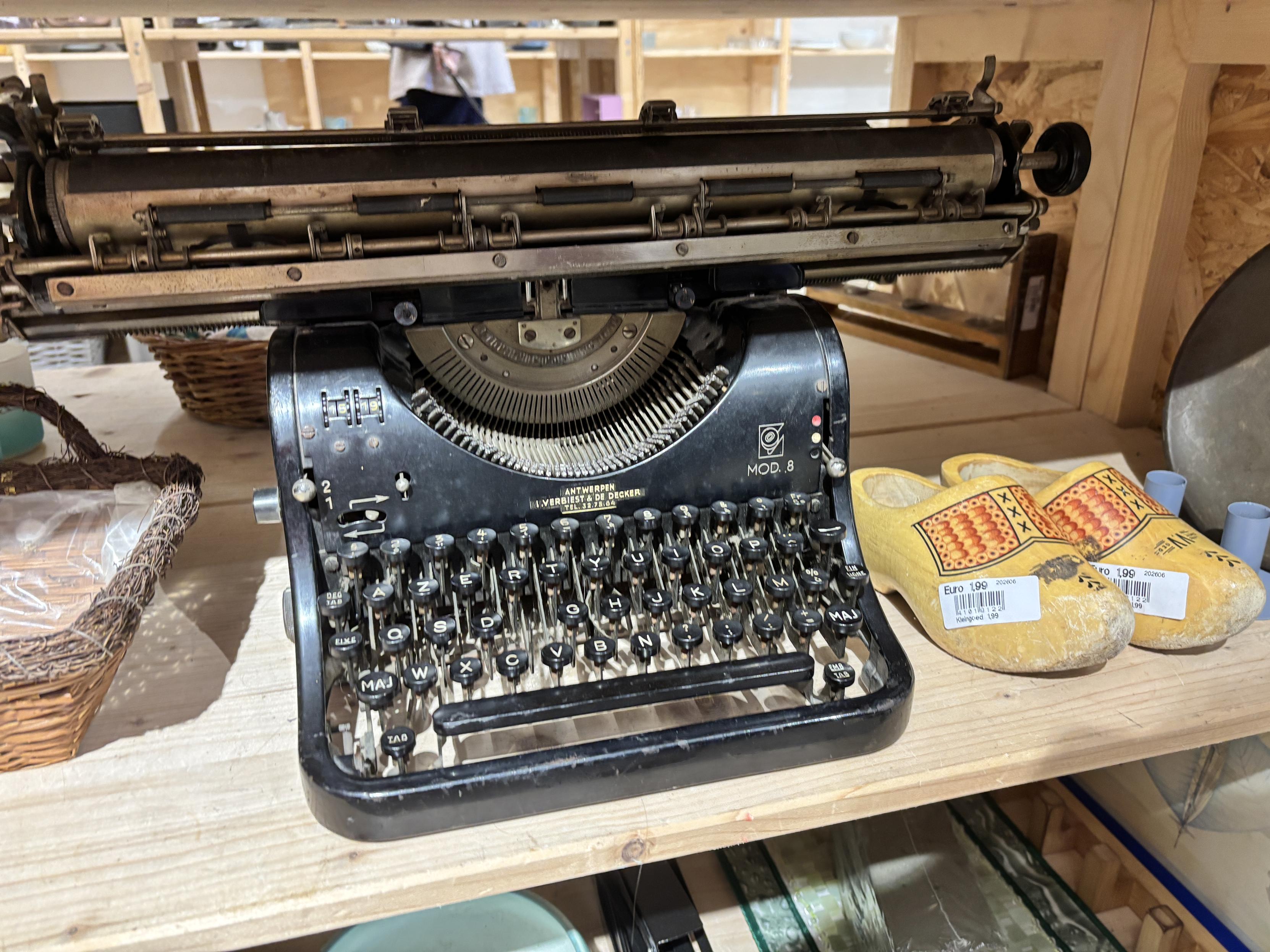
I saw this typewriter in the thrift store and I have no idea what it was used for in the past!
Uncategorized 1
1
-
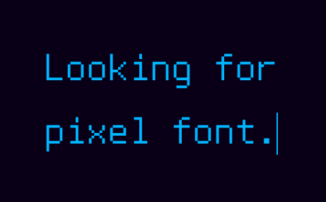
I'm a bit of a typography nerd but I need the help of better nerds, please and thank you:
Uncategorized 1
1
-
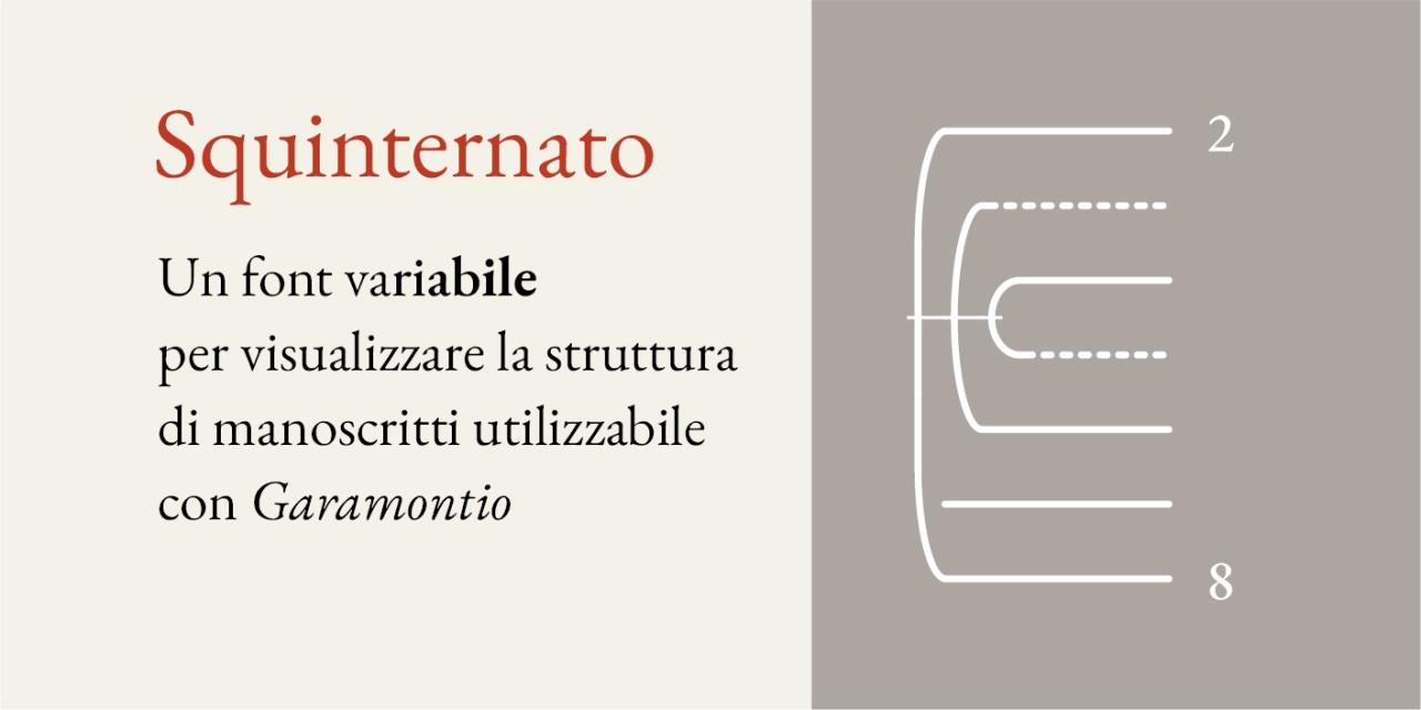
Squinternato: un font sperimentale variabile per visualizzare strutture di manoscrittihttps://github.com/m-casanova/Squinternato#font #typography
Uncategorized 1
1

