I've streamlined theme development in Ktistec.
-
I've streamlined theme development in Ktistec. The theming system uses a hierarchy of CSS custom properties and fallbacks. Theme authors can customize a theme at multiple levels:
Base Colors Only
Define only base colors like
--text-primary,--bg-primary,--bg-input,--semantic-primary, etc. Derived colors will auto-generate usingcolor-mixformulas. For example::root { --semantic-primary: #ffa500; }From this one line, theme-appropriate colors like
--bg-accent-code,--anchor-color, etc. auto-generate.Base Colors Plus Derived Colors
Define base colors and derived colors. Derived colors use custom values when defined. Undefined derived colors auto-generate. For example:
:root {
    --text-primary: #333;
    --text-primary-2: #ff0000;  /* red for this specific shade */
}
Given this theme, derived shades like
--text-primary-1,--text-primary-3, and--text-primary-4auto-generate.--text-primary-2is red.The simplest possible interesting theme redefines the primary semantic color. The single line above (in Base Colors Only) would result in the following, with button color, link color, disabled, selected, and hover states all derived automatically:
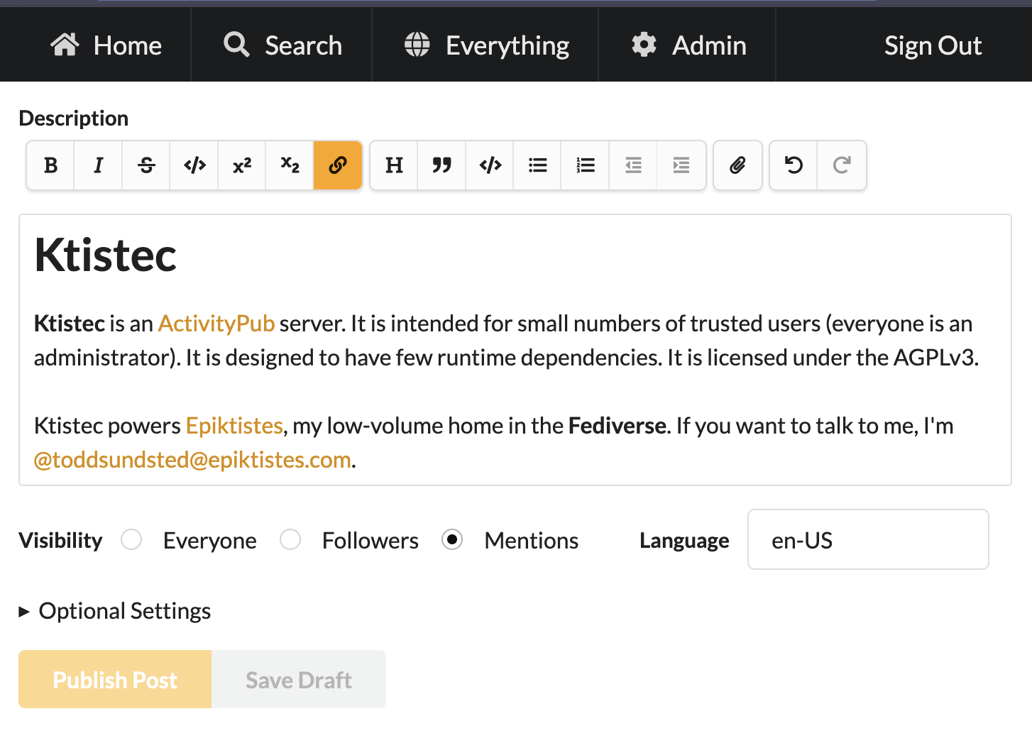
screenshot of the setting page with the primary semantic color defined These changes will be in the upcoming release. Existing themes will continue to work, as is.
-
I've streamlined theme development in Ktistec. The theming system uses a hierarchy of CSS custom properties and fallbacks. Theme authors can customize a theme at multiple levels:
Base Colors Only
Define only base colors like
--text-primary,--bg-primary,--bg-input,--semantic-primary, etc. Derived colors will auto-generate usingcolor-mixformulas. For example::root { --semantic-primary: #ffa500; }From this one line, theme-appropriate colors like
--bg-accent-code,--anchor-color, etc. auto-generate.Base Colors Plus Derived Colors
Define base colors and derived colors. Derived colors use custom values when defined. Undefined derived colors auto-generate. For example:
:root {
    --text-primary: #333;
    --text-primary-2: #ff0000;  /* red for this specific shade */
}
Given this theme, derived shades like
--text-primary-1,--text-primary-3, and--text-primary-4auto-generate.--text-primary-2is red.The simplest possible interesting theme redefines the primary semantic color. The single line above (in Base Colors Only) would result in the following, with button color, link color, disabled, selected, and hover states all derived automatically:
screenshot of the setting page with the primary semantic color defined These changes will be in the upcoming release. Existing themes will continue to work, as is.
@toddsundsted did you use any literature for deciding on the theme basic colors and how to combine them?
I've been struggling with something very similar a while back and the material design specs seemed too complex for what I wanted, but nothing else popped up on search.
-
System moved this topic from General Discussion on
-
@toddsundsted did you use any literature for deciding on the theme basic colors and how to combine them?
I've been struggling with something very similar a while back and the material design specs seemed too complex for what I wanted, but nothing else popped up on search.
@mariusor no, i'm still trying to figure that out myself. what i have done is build something that seems capable of handling themes that i find that i like. but even there i guess i have ~2-3 more revisions before it is fully capable.
i did pick semantic ui as my base framework. it has worked well, but it is abandoned. there is a fork called fomantic ui that is supported, but it is also much larger. other frameworks also seemed too large for my tastes, but i will admit to not doing a ton of research.
-
@mariusor no, i'm still trying to figure that out myself. what i have done is build something that seems capable of handling themes that i find that i like. but even there i guess i have ~2-3 more revisions before it is fully capable.
i did pick semantic ui as my base framework. it has worked well, but it is abandoned. there is a fork called fomantic ui that is supported, but it is also much larger. other frameworks also seemed too large for my tastes, but i will admit to not doing a ton of research.
@toddsundsted ok, bookmarked. When I'll circle back to ONI themeing I'll send some feedback your way to compare notes. :D
With ONI I tried to be "fun" and I generate a basic palette from the images actors upload as their Icon and Image properties (ie, profile and header picture in mastodon terms :D) As you can imagine that can lead to very dubious results.
Gli ultimi otto messaggi ricevuti dalla Federazione
-
@silverpill
Yep! Just was on vacation and had a conference to do. It's on my list for Monday to do some followup and updates
-
@toddsundsted ok, bookmarked. When I'll circle back to ONI themeing I'll send some feedback your way to compare notes. :D
With ONI I tried to be "fun" and I generate a basic palette from the images actors upload as their Icon and Image properties (ie, profile and header picture in mastodon terms :D) As you can imagine that can lead to very dubious results.
-
@mariusor no, i'm still trying to figure that out myself. what i have done is build something that seems capable of handling themes that i find that i like. but even there i guess i have ~2-3 more revisions before it is fully capable.
i did pick semantic ui as my base framework. it has worked well, but it is abandoned. there is a fork called fomantic ui that is supported, but it is also much larger. other frameworks also seemed too large for my tastes, but i will admit to not doing a ton of research.
-
@toddsundsted did you use any literature for deciding on the theme basic colors and how to combine them?
I've been struggling with something very similar a while back and the material design specs seemed too complex for what I wanted, but nothing else popped up on search.
-
I've streamlined theme development in Ktistec. The theming system uses a hierarchy of CSS custom properties and fallbacks. Theme authors can customize a theme at multiple levels:
Base Colors Only
Define only base colors like --text-primary, --bg-primary, --bg-input, --semantic-primary, etc. Derived colors will auto-generate using color-mix formulas. For example:
:root { --semantic-primary: #ffa500; }From this one line, theme-appropriate colors like --bg-accent-code, --anchor-color, etc. auto-generate.
Base Colors Plus Derived Colors
Define base colors and derived colors. Derived colors use custom values when defined. Undefined derived colors auto-generate. For example:
:root { --text-primary: #333; --text-primary-2: #ff0000; /* red for this specific shade */ }Given this theme, derived shades like --text-primary-1, --text-primary-3, and --text-primary-4 auto-generate. --text-primary-2 is red.
The simplest possible interesting theme redefines the primary semantic color. The single line above (in Base Colors Only) would result in the following, with button color, link color, disabled, selected, and hover states all derived automatically:
screenshot of the setting page with the primary semantic color definedThese changes will be in the upcoming release. Existing themes will continue to work, as is.
-
@tofeo take a look at https://gitlab.com/edent/activity-bot/-/blob/main/README_nginx.md?ref_type=heads
I don't use nginx, but that should help.
-
I discover your onepage activitypub application at https://shkspr.mobi/blog/2024/02/activitypub-server-in-a-single-file/
It is really a good start for me
But how would you adapt it with Ngnix server
All the logic is based on .htaccess but in Nginx it leads with all 404 pages
-
@julian 😘