i don't... hate... this?
Uncategorized
73
Posts
37
Posters
0
Views
-
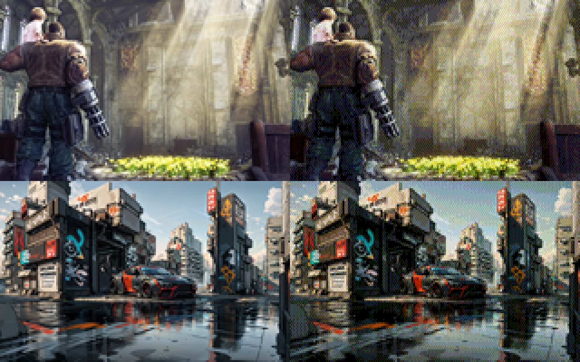
i added a 0-1 scalar that biases colors towards non-dithered to make things less busy. here's factors 0, 0.25, 0.5, and 0.75 in order:
@eniko without my glasses, at full screen and brightness and with my (OLED) phone at 30 cms from my face, I'd say .25 looks better
With my glasses on and my phone as I usually use it, I'd say .5
On any other screen I'm honestly not so sure, but the sweetspot seems to be arround there
-
i added a 0-1 scalar that biases colors towards non-dithered to make things less busy. here's factors 0, 0.25, 0.5, and 0.75 in order:
@eniko What is it about lowres dithered images that make you feel right at home and nostalgic?
They feel like a good book that provides a mental image with just the right amount of description and let your imagination fill in the details.
I like the .5 and .75 biased ones.
-
-
i added a 0-1 scalar that biases colors towards non-dithered to make things less busy. here's factors 0, 0.25, 0.5, and 0.75 in order:
@eniko Nice. The 1:2 pixel aspect pleasantly reminds me of the Amiga's "Medium-Res". 💚
-
@Texan_Reverend whoa that looks so cool!
@eniko @Texan_Reverend Keep in mind that even on pretty bad CRT monitors, the picture would look much closer to what it looks like on LCDs than on CRT TVs. VGA monitors were not that bad.
-
i added a 0-1 scalar that biases colors towards non-dithered to make things less busy. here's factors 0, 0.25, 0.5, and 0.75 in order:
what's shocking me the most is that images with a lot of blues in it still work really well, despite only having 2 bits of blue (so 0, 85, 170, and 255)
-
what's shocking me the most is that images with a lot of blues in it still work really well, despite only having 2 bits of blue (so 0, 85, 170, and 255)
@eniko I still can’t believe how readable those images are at such a low resolution.
-
what's shocking me the most is that images with a lot of blues in it still work really well, despite only having 2 bits of blue (so 0, 85, 170, and 255)
@eniko I think this is because what makes blue so evocative is how much of other colors it has in it. Cool vs warm blues...
-
what's shocking me the most is that images with a lot of blues in it still work really well, despite only having 2 bits of blue (so 0, 85, 170, and 255)
ok i found this utility by @Mattias_G https://mattiasgustavsson.itch.io/crtview and i'm going to take a shortcut
expect some more pretty images shortly >_>
-
what's shocking me the most is that images with a lot of blues in it still work really well, despite only having 2 bits of blue (so 0, 85, 170, and 255)
@eniko the human eye is much more sensitive to green than it is to red and blue. you can absolutely get away with shrinking your color encoding along the red and blue axes and have a mostly identifiable image come out the other end.
additionally, if you're open to other color formats, the human eye is more sensitive to brightness intensity than color shade. you can include only grayscale data for 3 out of 4 pixels and the image will also look mostly the same.
-
@eniko the human eye is much more sensitive to green than it is to red and blue. you can absolutely get away with shrinking your color encoding along the red and blue axes and have a mostly identifiable image come out the other end.
additionally, if you're open to other color formats, the human eye is more sensitive to brightness intensity than color shade. you can include only grayscale data for 3 out of 4 pixels and the image will also look mostly the same.
@spinach i've considered switching to a different color space than RGB but keeping things RGB has some benefits for this engine because i can only really do "blending" effects with bitwise tricks, and that's a lot easier to do in RGB
-
i added a 0-1 scalar that biases colors towards non-dithered to make things less busy. here's factors 0, 0.25, 0.5, and 0.75 in order:
@eniko Maybe it could work even better if you factor in the brightness delta of the dithered pixels? In areas where mostly only the colour is different, dithering can be more prominent without being obvious
-
what's shocking me the most is that images with a lot of blues in it still work really well, despite only having 2 bits of blue (so 0, 85, 170, and 255)
@eniko
There was a good article floating around a while back called "your eyes suck at blue".It showed that you can take any random image and double the size of the blue pixel, you won't be able to tell (or just barely.) They even suggested a pixel layout of a blue diamond with two green triangles and two red triangles to form a square.
Looks like a corollary is that you can get away with much less blue resolution!
-
@eniko the human eye is much more sensitive to green than it is to red and blue. you can absolutely get away with shrinking your color encoding along the red and blue axes and have a mostly identifiable image come out the other end.
additionally, if you're open to other color formats, the human eye is more sensitive to brightness intensity than color shade. you can include only grayscale data for 3 out of 4 pixels and the image will also look mostly the same.
-
i added a 0-1 scalar that biases colors towards non-dithered to make things less busy. here's factors 0, 0.25, 0.5, and 0.75 in order:
@eniko I like the last one best - multiple scales in the same image, adds visual interest.
-
@spinach i've considered switching to a different color space than RGB but keeping things RGB has some benefits for this engine because i can only really do "blending" effects with bitwise tricks, and that's a lot easier to do in RGB
@eniko so here's the other side of that trick. if you use a YCbCr format, you can apply all of your blending tricks to only the Y plane, and that's usually enough to get most of the idea across
-
-
@eniko so here's the other side of that trick. if you use a YCbCr format, you can apply all of your blending tricks to only the Y plane, and that's usually enough to get most of the idea across
@spinach how would you distribute the bits for that though?
-
@eniko @Texan_Reverend Keep in mind that even on pretty bad CRT monitors, the picture would look much closer to what it looks like on LCDs than on CRT TVs. VGA monitors were not that bad.
@jernej__s @eniko I'm well aware.
However, dithering gets considerably smoothed on consumer CRT TVs using composite connections - which helped consoles like the PS1 make acceptable use of it. So, I thought it would be neat to see how these retro-styled images looked in that context. -
what's shocking me the most is that images with a lot of blues in it still work really well, despite only having 2 bits of blue (so 0, 85, 170, and 255)
Well, your eye is least sensitive to blue, so you need a bigger difference in blue brightness to sense the same change you see with smaller differences in red or green. Back in the day, that's why we often used an eight-bit palette with 3 red, 3 green, and 2 blue bits.
Some of this is addressed here: https://www.2020mag.com/article/a-brief-look-at-the-theory-of-color-perception#:~:text=If%20the%20wavelengths%20of%20light,Source:%20deron.meranda.us
Feed RSS
Gli ultimi otto messaggi ricevuti dalla Federazione
-
@nonnominkia pronto il decretino meloni sanremo
-
Vendola nuovamente rinviata giudizio sul caso ILVA
-
Luigi Milani (@luigimilani.bsky.social)
https://bsky.app/profile/luigimilani.bsky.social/post/3megnf7tv4s2d
> A proposito dell’inno urlato dalla #Pausini
-
ULTIM'ORA!!!!
Petrecca sostituisce Pucci a Sanremo!
-
@athas Blue? 8-D
-
@Otttoz ma amico della buona musica 😜
-
@las_lallero @floreana gli elfi?
possibile che fosse il videogiuoco, nel libro c'è tutto il subplot di Hermione che scopre l'esistenza degli elfi, si scandalizza e decide di salvarli fondando un'associazione or something in loro tutela, con tanto di acronimo ridicolo
non è che sia scritta *benissimo* (e onestamente non ricordo i dettagli perché da quando ho letto i libri è passato qualche mese, perché io sono giovane e quindi i libri sono usciti l'altro ieri, *giusto*?), ma almeno un elfo viene liberato con successo (e passa a lavorare (per un padrone buono) per uno stipendio. vabbé)
però alcuni aspetti (tipo l'acronimo ridicolo) si possono anche far passare in quanto young adult, è ancora in uno dei primi libri quando i protagonisti avevano tipo 13 anni, mi pare, e idem il pubblico target
-
@Ashedryden Someone should make a biometric randomization app already, which takes your likeness and then change the core face metrics randomly.
