I'm happier with this one, same paper but different watercolors!(long rambling about process in the comments)'n#MastoArt #watercolor
Uncategorized
6
Posts
1
Posters
23
Views
-
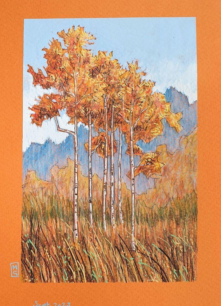
I'm happier with this one, same paper but different watercolors!
(long rambling about process in the comments) -
I'm happier with this one, same paper but different watercolors!
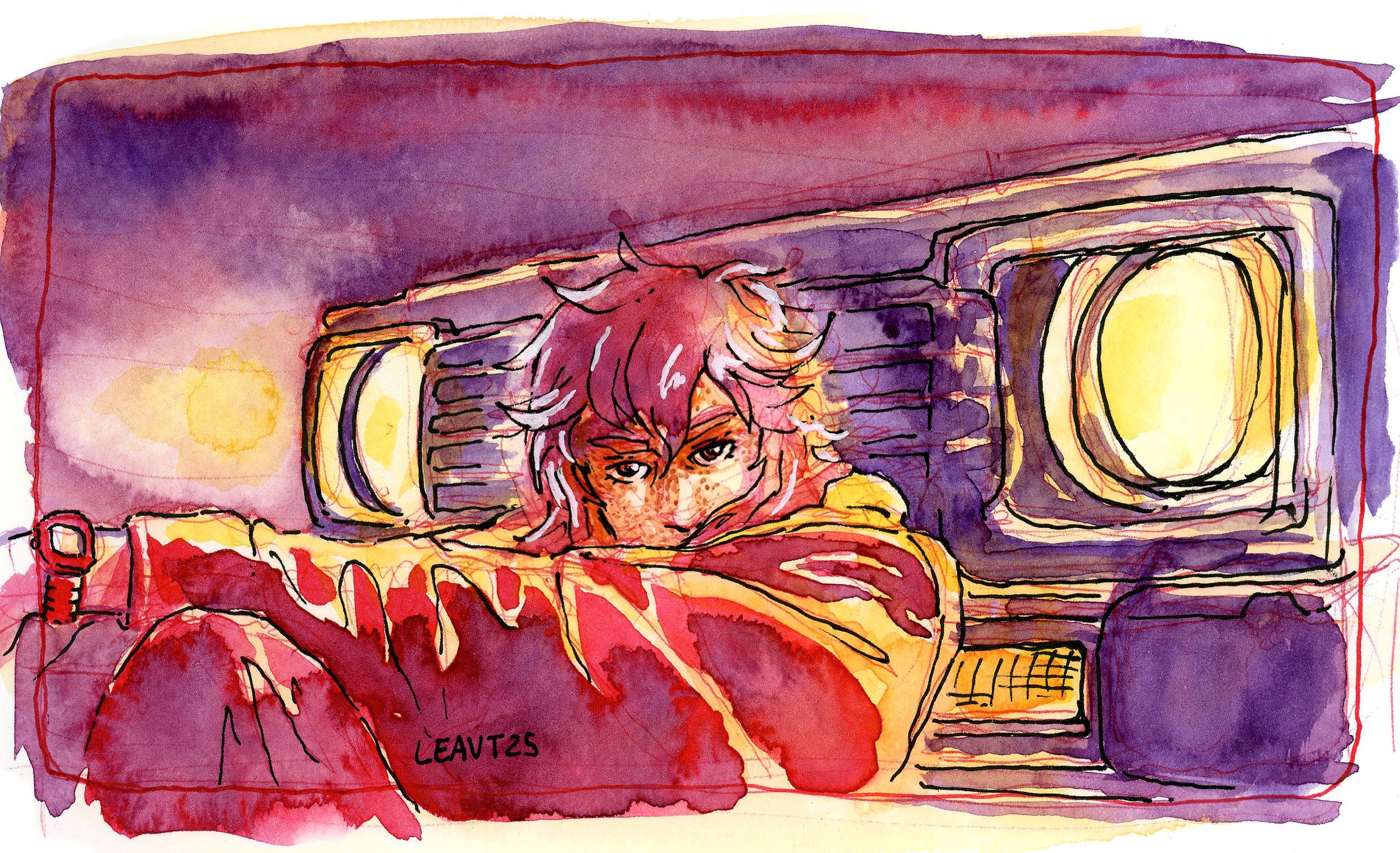
(long rambling about process in the comments)I remembered i've actually got some nice samples from Beam paints (made in 🇨🇦 ) a while ago and tried those out, way better quality.
This time i tried to do less passes, a first light pass with yellow and pink, waited for it to dry, then another heavy pass for shadows with red and purple, those pigments were wayyy better, more intense and thicker while still being transparent AND they blend really well together. -
I remembered i've actually got some nice samples from Beam paints (made in 🇨🇦 ) a while ago and tried those out, way better quality.
This time i tried to do less passes, a first light pass with yellow and pink, waited for it to dry, then another heavy pass for shadows with red and purple, those pigments were wayyy better, more intense and thicker while still being transparent AND they blend really well together.Look at the effect in the blurry background and the shadows of the clothes, that's what i was trying to achieve! However, when i tried to add 3rd layer of shadows, i got the muddy pigments patties that i dislike 🤣 you can see it in the right side of the image, the purple dark part on the bumper and the front grid. I also added some white lines on the hair because i thought i wanted details there but regretted, it looks sloppy lol
I'm on the right direction but i have to make it even more simple -
Look at the effect in the blurry background and the shadows of the clothes, that's what i was trying to achieve! However, when i tried to add 3rd layer of shadows, i got the muddy pigments patties that i dislike 🤣 you can see it in the right side of the image, the purple dark part on the bumper and the front grid. I also added some white lines on the hair because i thought i wanted details there but regretted, it looks sloppy lol
I'm on the right direction but i have to make it even more simplemy ref: (https://kr.pinterest.com/pin/604256475043126473/)
Also how i know it went way better: i barely had to do any color correction after scanning, it' very close to how it looks in person. I also love that the colors bleed out of the panel borders, that are themself red. That's something i saw on a comic my pal Okenki made, As their are not on the fedi i can tell without embarrassing them that they are a comic genius (example https://okenki.tumblr.com/post/770916502962634752)
Anyway, looks like i'm buying Beam paint's full set (expensive)
-
my ref: (https://kr.pinterest.com/pin/604256475043126473/)
Also how i know it went way better: i barely had to do any color correction after scanning, it' very close to how it looks in person. I also love that the colors bleed out of the panel borders, that are themself red. That's something i saw on a comic my pal Okenki made, As their are not on the fedi i can tell without embarrassing them that they are a comic genius (example https://okenki.tumblr.com/post/770916502962634752)
Anyway, looks like i'm buying Beam paint's full set (expensive)
as far as Joann Sfarr fell off his pedestal, I will still remember his 2 rules of colors i heard on a documentary about him: never color the things the way they are supposed to, and always color outside the lines
-
as far as Joann Sfarr fell off his pedestal, I will still remember his 2 rules of colors i heard on a documentary about him: never color the things the way they are supposed to, and always color outside the lines
other artists that inspire me for this watercolor leveling up : Emma Rios and her comic Anzuelo (https://www.simonandschuster.com/books/Anzuelo/Emma-Rios/9798368809267)
and Guillaume Siguelin with his comic PTSD (https://www.ankama-shop.com/en/ankama-graphic-novel-20th-anniversary-limited-edition/4263-ptsd-20th-anniversary-limited-edition-guillaume-singelin.html)
PTSD has the red sketching lines kept in the final pages. Now that's something i was already doing bc i'm lazy, but seeing it on a stylish, finished comic really excited me! idk if i should keep them if i want to simplify my style, but i love them very much and it makes my process so much quicker -
 undefined oblomov@sociale.network shared this topic on
Gli ultimi otto messaggi ricevuti dalla Federazione
-
🔴 🎙️ Domani alle 9 disponibile una nuova puntata de La settimana phastidiosa. I sostenitori su Spreaker possono ascoltarla dalle 7 e senza pubblicità iscrivendosi qui:
https://www.spreaker.com/podcast/phastidio-podcast--4672101/support
-
@smaurizi nosepodiasaber 🤡
-
Appena iniziato e ho già una voglia matta di comprare una nuova cucina
-
This post did not contain any content.
-
No no anzi, la trovo una pessima usanza, indica molto bene quanta poca considerazione ci sia della democrazia, al di là delle dichiarazioni.
-
And if I remember correctly OpenClipart hosts Public Domain svgs. I'm a proud contributor since long.
-
@aeva @eniko Sean's not accepting any new libs. but if you have it on the web somewhere, r-lyeh maintains a list https://github.com/r-lyeh/single_file_libs and the stb FAQ links to it
-
Jack Dorsey’s Block lays off 4,000, blames AI. Is it just an excuse? https://blog.quintarelli.it/2026/02/jack-dorseys-block-lays-off-4000-blames-ai-is-it-just-an-excuse/