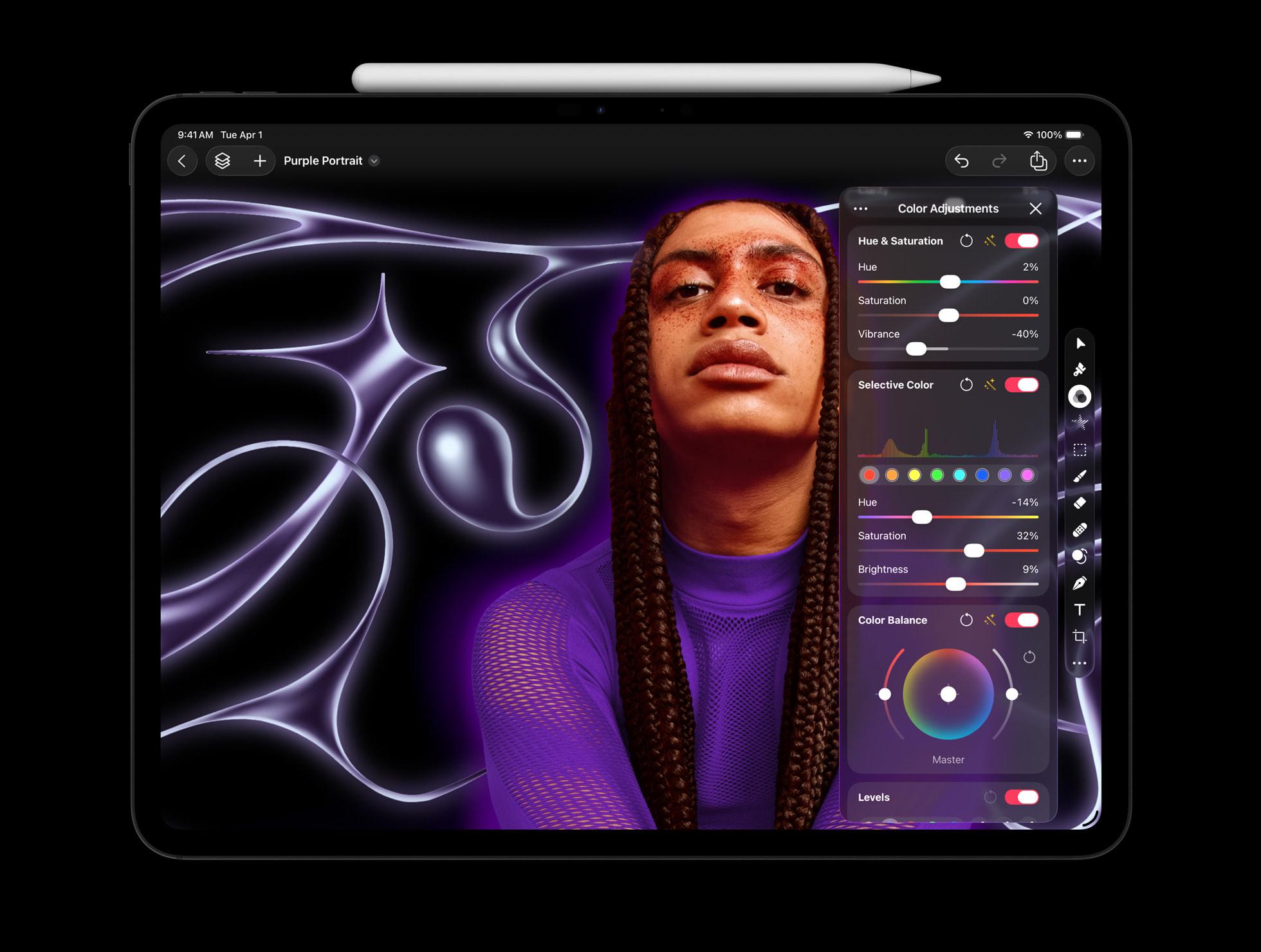
These images from the Creator Studio announcement perfectly illustrate the failure of Liquid Glass.
Uncategorized
28
Posts
24
Posters
121
Views

-
These images from the Creator Studio announcement perfectly illustrate the failure of Liquid Glass.
It doesn't get out of the way of your content — it INVADES your content.
This is an image editor! Yet HUGE regions of the image are invaded, blurred, and obscured by translucent UI, making both the image and the UI worse.
Low-contrast UI on blurry content doesn't clarify anything or get out of your way — it distorts the content AND the UI into an ugly, unusable slurry.
@marcoarment The iTunes app in iOS 26 got the best Liquid Glass overhaul.
-
These images from the Creator Studio announcement perfectly illustrate the failure of Liquid Glass.
It doesn't get out of the way of your content — it INVADES your content.
This is an image editor! Yet HUGE regions of the image are invaded, blurred, and obscured by translucent UI, making both the image and the UI worse.
Low-contrast UI on blurry content doesn't clarify anything or get out of your way — it distorts the content AND the UI into an ugly, unusable slurry.
@marcoarment it looks very cool … until you actually need to use the controls. And, then you like f…k. I worked with a designer like that once who cannot be convinced that a low contrast combo of background and font color can actually hurt an old person eyes.
-
@marcoarment Its also yet another subscription service to help juice Apple's revenue numbers.
Gotta chase that sweet green, I'm so done with Apple.
Edit: looks like many apps can still be purchased up front so that is actually quite nice. A shame not all of them can be (they aren't allowing it for the iPad apps for instance)
@amonduin “Users can choose to purchase the Mac versions of Final Cut Pro, Pixelmator Pro, Logic Pro, Motion, Compressor, and MainStage individually as a one-time purchase”@marcoarment
-
@amonduin “Users can choose to purchase the Mac versions of Final Cut Pro, Pixelmator Pro, Logic Pro, Motion, Compressor, and MainStage individually as a one-time purchase”@marcoarment
@wyssdaniel @marcoarment Just saw that and updated my post. Thought about deleting the post but decided since others might have already seen it better to leave it up
-
These images from the Creator Studio announcement perfectly illustrate the failure of Liquid Glass.
It doesn't get out of the way of your content — it INVADES your content.
This is an image editor! Yet HUGE regions of the image are invaded, blurred, and obscured by translucent UI, making both the image and the UI worse.
Low-contrast UI on blurry content doesn't clarify anything or get out of your way — it distorts the content AND the UI into an ugly, unusable slurry.
Remember that Apple commercial where some big hydraulic press was crushing every art instrument (musical, visual, etc) into one 'app'.
That's the goal.
Deter creativity. Consume the machine slop - creative people think too much.
-
@wyssdaniel @marcoarment Just saw that and updated my post. Thought about deleting the post but decided since others might have already seen it better to leave it up
@amonduin @wyssdaniel @marcoarment Been waiting on the iPad version of Pixelmator Pro for years. Now they finally release it and lock it behind a costly subscription included in a bundle of other apps that I’ll never use, just like an awful cable subscription. I only want to watch one channel yet I have to pay for all 300. 👎👎👎
-
These images from the Creator Studio announcement perfectly illustrate the failure of Liquid Glass.
It doesn't get out of the way of your content — it INVADES your content.
This is an image editor! Yet HUGE regions of the image are invaded, blurred, and obscured by translucent UI, making both the image and the UI worse.
Low-contrast UI on blurry content doesn't clarify anything or get out of your way — it distorts the content AND the UI into an ugly, unusable slurry.
@marcoarment I like it a lot. I’d rather have it on my content than make my content smaller.
-
These images from the Creator Studio announcement perfectly illustrate the failure of Liquid Glass.
It doesn't get out of the way of your content — it INVADES your content.
This is an image editor! Yet HUGE regions of the image are invaded, blurred, and obscured by translucent UI, making both the image and the UI worse.
Low-contrast UI on blurry content doesn't clarify anything or get out of your way — it distorts the content AND the UI into an ugly, unusable slurry.
@marcoarment I would have trouble adjusting contrast on that second image with the side of the person’s face cut off. That’s bonkers
-
These images from the Creator Studio announcement perfectly illustrate the failure of Liquid Glass.
It doesn't get out of the way of your content — it INVADES your content.
This is an image editor! Yet HUGE regions of the image are invaded, blurred, and obscured by translucent UI, making both the image and the UI worse.
Low-contrast UI on blurry content doesn't clarify anything or get out of your way — it distorts the content AND the UI into an ugly, unusable slurry.
@marcoarment I actually love it. If it wasn't translucent, it would still be there in the way, so I don't understand what's wrong?
-
These images from the Creator Studio announcement perfectly illustrate the failure of Liquid Glass.
It doesn't get out of the way of your content — it INVADES your content.
This is an image editor! Yet HUGE regions of the image are invaded, blurred, and obscured by translucent UI, making both the image and the UI worse.
Low-contrast UI on blurry content doesn't clarify anything or get out of your way — it distorts the content AND the UI into an ugly, unusable slurry.
@marcoarment But the tools aren’t covering the final art, only the bleed/overflow. The final artwork in this case would presumably be a cropped square to use for the podcast icon.
-
These images from the Creator Studio announcement perfectly illustrate the failure of Liquid Glass.
It doesn't get out of the way of your content — it INVADES your content.
This is an image editor! Yet HUGE regions of the image are invaded, blurred, and obscured by translucent UI, making both the image and the UI worse.
Low-contrast UI on blurry content doesn't clarify anything or get out of your way — it distorts the content AND the UI into an ugly, unusable slurry.
@marcoarment I feel so "immersed"
-
@marcoarment The iTunes app in iOS 26 got the best Liquid Glass overhaul.
@stuarticus @marcoarment I really like how the corner is not rounded up near New Albums. I'm really tapped out on the rounding of everything for some reason.
-
These images from the Creator Studio announcement perfectly illustrate the failure of Liquid Glass.
It doesn't get out of the way of your content — it INVADES your content.
This is an image editor! Yet HUGE regions of the image are invaded, blurred, and obscured by translucent UI, making both the image and the UI worse.
Low-contrast UI on blurry content doesn't clarify anything or get out of your way — it distorts the content AND the UI into an ugly, unusable slurry.
@marcoarment Remember around the Mac Pro summit @gruber attended, didn’t Apple announce a team of embedded creative professionals who were going to give practical feedback on hardware and software? I guess they’re gone.
-
@marcoarment But the tools aren’t covering the final art, only the bleed/overflow. The final artwork in this case would presumably be a cropped square to use for the podcast icon.
@Sumocat @marcoarment No they specifically designed content that would look less bad in the ui. The leaves continue on the left under the sidebar.
-
These images from the Creator Studio announcement perfectly illustrate the failure of Liquid Glass.
It doesn't get out of the way of your content — it INVADES your content.
This is an image editor! Yet HUGE regions of the image are invaded, blurred, and obscured by translucent UI, making both the image and the UI worse.
Low-contrast UI on blurry content doesn't clarify anything or get out of your way — it distorts the content AND the UI into an ugly, unusable slurry.
@marcoarment I don't think I've ever seen an image editor that pops up editing panels overtop the image before. Wow.
-
@Sumocat @marcoarment No they specifically designed content that would look less bad in the ui. The leaves continue on the left under the sidebar.
@dandylyons @marcoarment The screenshot of the Mac version is presented the same way, but the overflow and top of her head are completely cut off.
-
@marcoarment I actually love it. If it wasn't translucent, it would still be there in the way, so I don't understand what's wrong?
@marcoarment @d4v, but it would be less in the way: look how much space is wasted on the unnecessary padding around the sidebars and other UI elements that previously would be flush to the screen edge. I mean I’m not against negative space in UI but those double paddings, ubiquitous in the new design, are useless, imho.
And the UI would be so much more readable without all that translucency!
-
@marcoarment @d4v, but it would be less in the way: look how much space is wasted on the unnecessary padding around the sidebars and other UI elements that previously would be flush to the screen edge. I mean I’m not against negative space in UI but those double paddings, ubiquitous in the new design, are useless, imho.
And the UI would be so much more readable without all that translucency!
@volemo @marcoarment On second thought, I have to agree with you that’s a lot of wasted space. 😵💫
-
These images from the Creator Studio announcement perfectly illustrate the failure of Liquid Glass.
It doesn't get out of the way of your content — it INVADES your content.
This is an image editor! Yet HUGE regions of the image are invaded, blurred, and obscured by translucent UI, making both the image and the UI worse.
Low-contrast UI on blurry content doesn't clarify anything or get out of your way — it distorts the content AND the UI into an ugly, unusable slurry.
@marcoarment NOT GOOD
-
These images from the Creator Studio announcement perfectly illustrate the failure of Liquid Glass.
It doesn't get out of the way of your content — it INVADES your content.
This is an image editor! Yet HUGE regions of the image are invaded, blurred, and obscured by translucent UI, making both the image and the UI worse.
Low-contrast UI on blurry content doesn't clarify anything or get out of your way — it distorts the content AND the UI into an ugly, unusable slurry.
Feed RSS
Gli ultimi otto messaggi ricevuti dalla Federazione
-
Very new moon over the gate tonight.
-
Are you allowed to protest the war on Iran at #NoKings / #NoTyrants ?
-
@informapirata @signorina37 @eticadigitale ottima analisi: un concentrato di verità assoluta, senza se e senza ma.
Io spesso mi soffermo sugli aspetti della tecnologia dove eri praticamente costretto a leggere il manuale per saperla usare, e avere una dose di pazienza non indifferente, tipo regolare l'azimuth di un lettore di cassette, ma c'era anche il discorso giochi, decisamente più incisivo e comune, che avevo "rimosso".
Con le Crystal Ball e il DAS ci sono cresciuto 😃
-
Slug Algorithm for On-GPU Rendering of Fonts with Bézier Curves now in Public Domain
The Slug Algorithm has been around for a decade now, mostly quietly rendering fonts and later entire GUIs using Bézier curves directly on the GPU for games and other types of software, but due to its proprietary nature it didn’t see much adoption outside of commercial settings. This has now changed with its author, [Eric Lengyel], releasing it to the public domain without any limitations.
Originally [Eric] had received a software patent in 2019 for the algorithm that would have prevented anyone else from implementing it until the patent’s expiration in 2038. Since 2016 [Eric] and his business have however had in his eyes sufficient benefit from the patent, making it unnecessary to hold on to it any longer and retain such exclusivity.
To help anyone with implementing their own version of the algorithm, there is a GitHub repository containing reference shader implementations with plenty of inline comments that should help anyone with some shader experience get started.
Although pretty niche in the eyes of the average person, the benefits of using on-GPU rendering of elements like fonts are obvious in terms of rendering optimization. With this change open source rendering engines for games and more can finally also use it as well.
Thanks to [Footleg] for the tip.
-
@Moosader it's really good too
-
We report during the half hour in the evening when birds cannot help but sing. Recently, a few more species have joined the sparrows that kept on chirping through winter. We can only really pick out the blackbirds in the mix. It gets late, and dark, and the birds do not quiet.
-
@nada_eid_88 donation sent.
-
How many bolds could a kobold ko
If a kobold could kobolds