Rime
Uncategorized
1
Posts
1
Posters
14
Views
-
Rime.
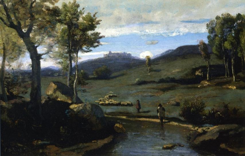
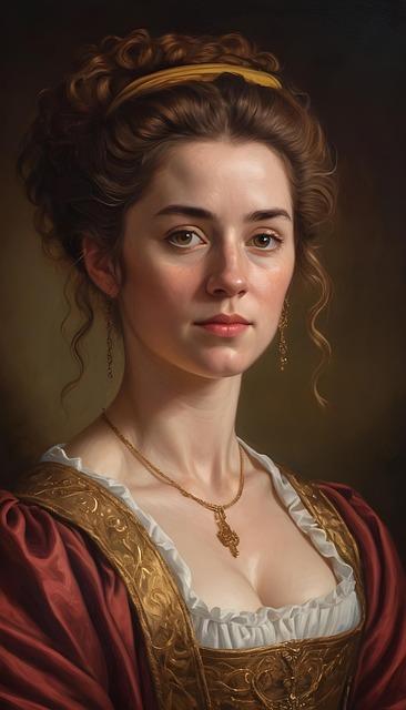
Raccolta di opere di Isabella Morra, poetessa del XVI secolo che fu vittima di un delitto d'onore ad opera dei fratelli (non ne abbiamo ritratti, l'illustrazione di giovane in abito del xvi secolo è opera di AI). La raccolta, molto apprezzata dal Croce, si può scaricare gratis, in pdf, da:https://liberliber.it/autori/autori-m/isabella-morra/rime/
#UnoLibri #libri #letteratura #public_domain #cosediscuola #cultura
-
 undefined diggita@mastodon.social shared this topic on
Feed RSS
Gli ultimi otto messaggi ricevuti dalla Federazione
-
Energia, salute, rischio e potere: noi cosa possiamo fare
@anarchia
due articoli di Luca Graziano. Riflessioni scomode per gli amministatori imprudenti ma utili alla collettività, a livello locale come su quello planetario. Costruire nella pianura dell’acqua Il dissesto idrogeologico e la scelta https://www.rivoluzioneanarchica.it/energia-salute-rischio-e-potere-noi-cosa-possiamo-fare/
-
Matematici a fumetti (libro)
@libri - Anche i matematici hanno fatto cose interessanti
-
Displaying the Rainbow
True or false? Your green laser pointer is more powerful than your red one. The answer is almost certainly false. They are, most likely, the same power, but your eye is far more sensitive to green, so it seems stronger. [Brandon Li] was thinking about how to best represent colors on computer screens and fell down the rabbit hole of what colors look like when arranged in a spectrum. Spoiler alert: almost all the images you see of the spectrum are incorrect in some way. The problem isn’t in our understanding of the physics, but more in the understanding of how humans perceive color.
Perception may start with physics, but it also extends to the biology of your eye and the psychology of your brain. What follows is a lot of math that finally winds up with the CIE 1931 color space diagram and the CIE 2012 system.
Some people obsess about fonts, and some about colors. If you are in the latter camp, this is probably old hat for you. However, if you want a glimpse into just how complicated it is to accurately represent colors, this is a fascinating read. You can learn about the Bezold-Brücke shift, the Helmholtz-Kohlrausch effect, and the Abney effect. Maybe that’ll help you win a bar bet one day.
The post winds up in the strangest place: spectroscopy. So if you want to see how color representation applies to analyzing blue sky, neon tubes, and a MacBook display, you’ll want to skip to the end.
We’ve nerded out on color spaces before. In some cases, the right representation is everything.
-
askatasuna...Spin Time occupato a Roma, per il mancato sgombero Viminale condannato a pagare 21 milion...a scata fascio
-
“I dottori cubani restano in Calabria”: il governo dice no a Washington
-
Senza se e senza ma. Anzi, forse. Il “no comment se non conosco” chiude la campagna flop di Salvini su Rogoredo
-
@repubblica @economia-la-repubblica-repubblica meloni quanto ci costi cara!
-
@repubblica @economia-la-repubblica-repubblica ma li emette giorgetti quello che ha avuto la moglie condannata per truffa?