So I'm figuring out the visual style for my newly-added dynamic water.
Uncategorized
8
Posts
7
Posters
4
Views
-
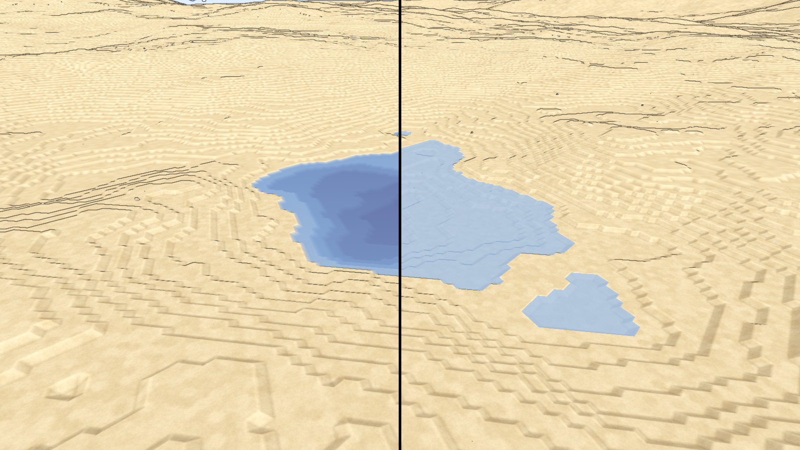
So I'm figuring out the visual style for my newly-added dynamic water. Made alpha & color depth-dependent, which should be more physically accurate (left) but seems to look worse than a flat color (right) when placed into my stylized game. Wdyt?
-
So I'm figuring out the visual style for my newly-added dynamic water. Made alpha & color depth-dependent, which should be more physically accurate (left) but seems to look worse than a flat color (right) when placed into my stylized game. Wdyt?
@lisyarus I like the depth-based coloring better
-
So I'm figuring out the visual style for my newly-added dynamic water. Made alpha & color depth-dependent, which should be more physically accurate (left) but seems to look worse than a flat color (right) when placed into my stylized game. Wdyt?
@lisyarus Left looks better imo.
-
So I'm figuring out the visual style for my newly-added dynamic water. Made alpha & color depth-dependent, which should be more physically accurate (left) but seems to look worse than a flat color (right) when placed into my stylized game. Wdyt?
@lisyarus I agree with the others. I like the depth styling. It reads more clearly that this lake is deeper than this other, etc. I don't know if that's a factor in the game mechanics like if certain resources can only be found in deeper water or whatever.
Ultimately it's your game and your style, so if you think the flat color looks better go for it. -
So I'm figuring out the visual style for my newly-added dynamic water. Made alpha & color depth-dependent, which should be more physically accurate (left) but seems to look worse than a flat color (right) when placed into my stylized game. Wdyt?
@lisyarus I prefer left. Has more interesting visual structure. The right version looks washed out to me
-
So I'm figuring out the visual style for my newly-added dynamic water. Made alpha & color depth-dependent, which should be more physically accurate (left) but seems to look worse than a flat color (right) when placed into my stylized game. Wdyt?
@lisyarus I like the depth dependent water better. I think it wants to be fancier though, like maybe fake caustics in the shallows, blur the depths, something on the shore line, some surface wiggle + some specular highlights.
I think the reason the plain version doesn't feel like it is missing anything is because it doesn't really look like water beyond being symbolically recognizable as semantic water. The plain version would actually be better if it was opaque imo.
-
@lisyarus I like the depth dependent water better. I think it wants to be fancier though, like maybe fake caustics in the shallows, blur the depths, something on the shore line, some surface wiggle + some specular highlights.
I think the reason the plain version doesn't feel like it is missing anything is because it doesn't really look like water beyond being symbolically recognizable as semantic water. The plain version would actually be better if it was opaque imo.
@lisyarus to put it another way, the version on the left looks like it is like 20% of the way to being really slick diorama water, and the version on the right looks like it is 80% of the way to being windwaker water.
-
 undefined oblomov@sociale.network shared this topic
-
So I'm figuring out the visual style for my newly-added dynamic water. Made alpha & color depth-dependent, which should be more physically accurate (left) but seems to look worse than a flat color (right) when placed into my stylized game. Wdyt?
I prefer the depth version too, though it would be handy to see it next to some other elements rather than just the sandy/rocky slopes to tell if it fits
Gli ultimi otto messaggi ricevuti dalla Federazione
-
@ozoned 🤦 it’s a pleasure! Glad you found the hidden treasure!
-
@vkc I'm really disappointed in this. I understand that you want to protect yourself and your followers but this is an important conversation to have. I'd like to see if we can figure it out at the protocol and technology level.
-
RE: https://social.growyourown.services/@FediFollows/116014190318886946
I love those things. They make life less…boring!
-
@kevinmarks.com 👀 I saw you but I didn't get to you before the talks started!
-
https://www.wired.it/article/trattato-new-start-stati-uniti-russia-scadenza/
Senza nuovi colloqui, termina l'unico strumento per la gestione della minaccia nucleare
-
@europeanspodcast closest thing would be LiberaPay but AFAIK it's based on very different principles, as it's designed primarily for donations to FLOSS projects/developers.
-
https://www.thewatcherpost.it/esteri/riarmo-nucleare-new-start-mancato-rinnovo/
L’appello di Papa Leone
Il Pontefice è seriamente preoccupato: «Nel rinnovare l’incoraggiamento ad ogni sforzo costruttivo in favore del disarmo e della fiducia reciproca rivolgo un pressante invito a non lasciar cadere questo strumento senza cercare di garantirgli un seguito concreto ed efficace. Un seguito necessario perché il futuro del mondo non sia segnato dalla corsa al riarmo e da una pace sempre più lontana che invece resta il patrimonio di tutti».
-
@adhdeanasl @itzyg yeah, but you see, this kind of math is rather complex.
