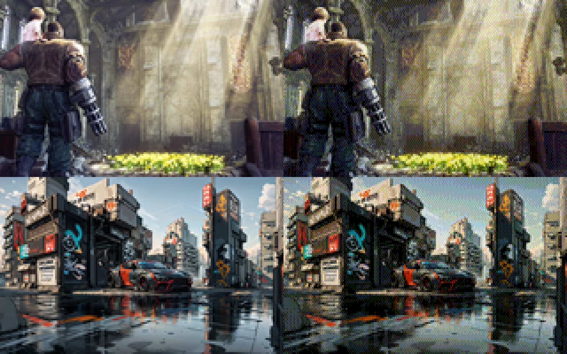
i don't... hate... this?
-
@eniko well i meant trying different dither algorithms. but also it might be interesting in adjacent bigpixels to alternate the alignment of the dither algorithm. like ranodmize which one is left side and which is right side to break up the rigid curtain feeling it has currently
@mcc oh thats an interesting idea
For just, like, artistic control, going in and manually tweaking things is always an option. Or creating assets with more flat color areas known to be undeterred values
-
@mcc oh thats an interesting idea
For just, like, artistic control, going in and manually tweaking things is always an option. Or creating assets with more flat color areas known to be undeterred values
@eniko i think there are some dither algorithms that follow rules similar to this one
-
@eniko i think there are some dither algorithms that follow rules similar to this one
@mcc I guess I could weight towards the pure colors? Might try that tomorrow and see how that works
-
huh. interesting. i think the ordered dither was actually interfering with the subpixel dither, because i like the one without the ordered dither (left) better than the earlier one with the ordered dither on top of the subpixel dither (right)
@eniko both look nice, but there's subtle differences with having both I prefer
-
@eniko both look nice, but there's subtle differences with having both I prefer
@disorderlyf having both creates vertical streaking artifacts though
-
@disorderlyf having both creates vertical streaking artifacts though
@eniko Could be they're less visible at the pixel density I'm viewing from
-
-
-
RE: https://mastodon.gamedev.place/@eniko/116036378192057724
i don't... hate... this?
like it's crumnchy. but is it too crumnchy? 🤔
(full color left, 8 bit color + dither on right)
@eniko oh this looks delicious
-
@Texan_Reverend whoa that looks so cool!
-
And now that I have a structured palette I know what bits are red, green, and blue, and so I can easily do cool effects using PUTs binary operations, OR, AND, and XOR
Fuck yeah this is going so well!
i added a 0-1 scalar that biases colors towards non-dithered to make things less busy. here's factors 0, 0.25, 0.5, and 0.75 in order:
-
i added a 0-1 scalar that biases colors towards non-dithered to make things less busy. here's factors 0, 0.25, 0.5, and 0.75 in order:
@eniko This dithering looks gorgeous.
-
@mcc I guess I could weight towards the pure colors? Might try that tomorrow and see how that works
@mcc what do you think of this? https://mastodon.gamedev.place/@eniko/116040108035560003
-
i added a 0-1 scalar that biases colors towards non-dithered to make things less busy. here's factors 0, 0.25, 0.5, and 0.75 in order:
@eniko reactions
AAAAA
oh
hmm?
blort -
@eniko reactions
AAAAA
oh
hmm?
blort@MachineLordZero is hmm? good
-
@MachineLordZero is hmm? good
@eniko it's more go back and check before, does this one feel better or does that one
*optometrist voice* 1, or 2? 1, or 2? -
i added a 0-1 scalar that biases colors towards non-dithered to make things less busy. here's factors 0, 0.25, 0.5, and 0.75 in order:
@eniko without my glasses, at full screen and brightness and with my (OLED) phone at 30 cms from my face, I'd say .25 looks better
With my glasses on and my phone as I usually use it, I'd say .5
On any other screen I'm honestly not so sure, but the sweetspot seems to be arround there
-
i added a 0-1 scalar that biases colors towards non-dithered to make things less busy. here's factors 0, 0.25, 0.5, and 0.75 in order:
@eniko What is it about lowres dithered images that make you feel right at home and nostalgic?
They feel like a good book that provides a mental image with just the right amount of description and let your imagination fill in the details.
I like the .5 and .75 biased ones.
-
-
i added a 0-1 scalar that biases colors towards non-dithered to make things less busy. here's factors 0, 0.25, 0.5, and 0.75 in order:
@eniko Nice. The 1:2 pixel aspect pleasantly reminds me of the Amiga's "Medium-Res". 💚
