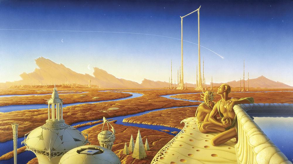
IN DAI CHIKIZA (1988)Acrylic on Watercolor Board - 18" x 46"
Uncategorized
12
Posts
5
Posters
38
Views

-
IN DAI CHIKIZA (1988)
Acrylic on Watercolor Board - 18" x 46"Creating the cover for the first book in a proposed epic trilogy can be a daunting task for an illustrator. They have to help the author gain an audience for a new fantasy world with a whole new cast of characters. 1/8
#fantasy #illustration #tadwilliams #memorysorrowandthorn #dawbooks
@MichaelWhelan oh I remember this cover! It actually made me buy the book 😚
-
No matter how intriguing, when a manuscript is especially long and complicated it's hard to choose one scene that will be faithful to the story and grab new readers. 2/8
Tad Williams’ Memory, Sorrow, and Thorn trilogy went on to become both a commercial success, with a long stretch on the New York Times bestseller list, and a critical hit with lasting impact on the genre.
George R.R. Martin cited the books as influential in his own smash hit A Song of Ice and Fire. He praised Tad’s work as “one of the great fantasy epics of all time.” 3/8
-
Tad Williams’ Memory, Sorrow, and Thorn trilogy went on to become both a commercial success, with a long stretch on the New York Times bestseller list, and a critical hit with lasting impact on the genre.
George R.R. Martin cited the books as influential in his own smash hit A Song of Ice and Fire. He praised Tad’s work as “one of the great fantasy epics of all time.” 3/8
The jacket art for the first volume of Memory, Sorrow, and Thorn features Jingizu (the Sithi word for “Sorrow”). It was a blade forged by the Storm King. 4/8
-
The jacket art for the first volume of Memory, Sorrow, and Thorn features Jingizu (the Sithi word for “Sorrow”). It was a blade forged by the Storm King. 4/8
It was a blade forged by the Storm King. Inspiration for the design came in these ominously detailed passages:
“…in a sheath at [King Elias’] side was the sword with the strange crossed hilt…there was something queer and unsettling about the blade…[It] had a strange double guard, the cross pieces making; with the hilt, a sort of five pointed star.” 5/8
-
It was a blade forged by the Storm King. Inspiration for the design came in these ominously detailed passages:
“…in a sheath at [King Elias’] side was the sword with the strange crossed hilt…there was something queer and unsettling about the blade…[It] had a strange double guard, the cross pieces making; with the hilt, a sort of five pointed star.” 5/8
“…[the blade] was no mere weapon, but a blasphemy against the earth that had yielded both iron and witchwood. It was a hole in the tapestry of creation, and life leaked away through it.” 6/8
-
“…[the blade] was no mere weapon, but a blasphemy against the earth that had yielded both iron and witchwood. It was a hole in the tapestry of creation, and life leaked away through it.” 6/8
When Tad returned to the kingdom of Osten Ard for a new story arc a few decades later, DAW Books asked me to provide illustrations of the swords that had decorated the spines of the original hardcovers. This time they would be placed front and center on the reissued covers. 7/8
-
The jacket art for the first volume of Memory, Sorrow, and Thorn features Jingizu (the Sithi word for “Sorrow”). It was a blade forged by the Storm King. 4/8
@MichaelWhelan Oh my gosh I love seeing this separate layer of detail, isolated like this.
-
When Tad returned to the kingdom of Osten Ard for a new story arc a few decades later, DAW Books asked me to provide illustrations of the swords that had decorated the spines of the original hardcovers. This time they would be placed front and center on the reissued covers. 7/8
The order of the swords was corrected to reflect the name of the series, the first being Minneyar, which translates to “year of memory.” I can’t say much more than that as spoilers abound—even decades later for some fans! 8/8
-
When Tad returned to the kingdom of Osten Ard for a new story arc a few decades later, DAW Books asked me to provide illustrations of the swords that had decorated the spines of the original hardcovers. This time they would be placed front and center on the reissued covers. 7/8
@MichaelWhelan i tend to prefer this *kind* of cover. maybe because i'm british? i noticed years ago (don't know if still true) that british SF/F covers tended to be more symbolic or metaphorical and american ones were like a still from the nonexistent movie version. don't know if that reflected a geographical cultural difference, or if it still exists?
-
The order of the swords was corrected to reflect the name of the series, the first being Minneyar, which translates to “year of memory.” I can’t say much more than that as spoilers abound—even decades later for some fans! 8/8
@MichaelWhelan One of the things I love about these descriptions of your cover art is that you've clearly read and enjoyed the works in question, and picked up on all the textual details.
There are some pieces of cover art where the artist has clearly only read the blurb for the book, or skimmed the text lightly, and missed important things.
-
 undefined oblomov@sociale.network shared this topic on
Gli ultimi otto messaggi ricevuti dalla Federazione
-
Una questione molto italiana. Di punto in bianco | La vittoria di #JamesTalarico riapre il dilemma strategico della sinistra americana - Linkiesta.it https://www.linkiesta.it/2026/03/democratici-coalizione-elettorale-crisi-strategia-talarico/
-
@gian_d_gian il trucchetto del professionista: bisogna imprecare anche quando non è necessario perchè così, quando è effettivamente necessario, sei già a credito.
-
@Nonya_Bidniss
AFAIK recharging is a 1.5 MegaWatt, 1000 Volts affair. Per single charging point/plug. Such powers and tensions are not only quite dangerous to handle but they will require extensive rebuilding of existing electrical networks
-
Leggo che al #cinema 40 anni fa non ebbe successo. Non ne dubito, anche se io la ricordo diversamente. Sarà pure che le canzoni dei #Queen comprese nella colonna sonora allora erano ovunque. Sicuramente "ne rimarrà uno solo" sarebbe stato un consiglio da seguire quando vennero realizzati X sequel. Usciva il 7 marzo 1986 (negli USA) Highlander - L'ultimo immortale https://streamingcommunityz.computer/it/watch/5268
-
Onda anomala: ultima generazione a processo. cosa cambia con il nuovo pacchetto sicurezza. intervista all’avvocata paola bevere
@anarchia
“Onda Anomala”- Notizie eventi movimenti dal clima che cambia, la trasmissione quindicinale di Radio Onda d’Urto all’interno della casetta degli attrezzi del martedi pomeriggio alle
-
@pressenza_italia Con Leonardo (Min. dell’Economia e delle Finanze italiano detiene il 30%) l’Italia è complice attivo dei crimini di Israele.
Leonardo fornisce:- i cannoni navali da 76 mm delle Sa’ar israeliane, testati su Gaza dal 16/11/2023
- elicotteri da addestramento AW119, aerei M-346 “Lavi”
- rimorchi cisterna per l’esercito Idf, contratti firmati mentre i bombardamenti su Gaza erano già in corso
- radar congiunti con RADA, in una joint venture italo-israeliana quotata anche a Tel Aviv
-
@gmarcosanti
meglio deludere il pubblico che imprecare per una scottatura
-
@rsiinfo pastori evangelici che non hanno mai letto il vangelo