i don't... hate... this?
Uncategorized
73
Posts
37
Posters
0
Views
-
@eniko the human eye is much more sensitive to green than it is to red and blue. you can absolutely get away with shrinking your color encoding along the red and blue axes and have a mostly identifiable image come out the other end.
additionally, if you're open to other color formats, the human eye is more sensitive to brightness intensity than color shade. you can include only grayscale data for 3 out of 4 pixels and the image will also look mostly the same.
@spinach i've considered switching to a different color space than RGB but keeping things RGB has some benefits for this engine because i can only really do "blending" effects with bitwise tricks, and that's a lot easier to do in RGB
-
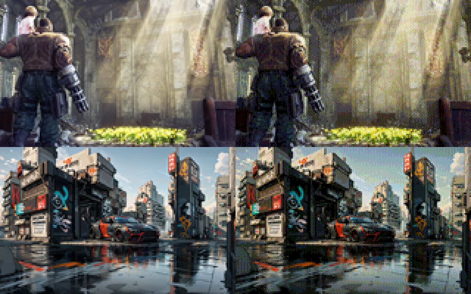
i added a 0-1 scalar that biases colors towards non-dithered to make things less busy. here's factors 0, 0.25, 0.5, and 0.75 in order:
@eniko Maybe it could work even better if you factor in the brightness delta of the dithered pixels? In areas where mostly only the colour is different, dithering can be more prominent without being obvious
-
what's shocking me the most is that images with a lot of blues in it still work really well, despite only having 2 bits of blue (so 0, 85, 170, and 255)
@eniko
There was a good article floating around a while back called "your eyes suck at blue".It showed that you can take any random image and double the size of the blue pixel, you won't be able to tell (or just barely.) They even suggested a pixel layout of a blue diamond with two green triangles and two red triangles to form a square.
Looks like a corollary is that you can get away with much less blue resolution!
-
@eniko the human eye is much more sensitive to green than it is to red and blue. you can absolutely get away with shrinking your color encoding along the red and blue axes and have a mostly identifiable image come out the other end.
additionally, if you're open to other color formats, the human eye is more sensitive to brightness intensity than color shade. you can include only grayscale data for 3 out of 4 pixels and the image will also look mostly the same.
-
i added a 0-1 scalar that biases colors towards non-dithered to make things less busy. here's factors 0, 0.25, 0.5, and 0.75 in order:
@eniko I like the last one best - multiple scales in the same image, adds visual interest.
-
@spinach i've considered switching to a different color space than RGB but keeping things RGB has some benefits for this engine because i can only really do "blending" effects with bitwise tricks, and that's a lot easier to do in RGB
@eniko so here's the other side of that trick. if you use a YCbCr format, you can apply all of your blending tricks to only the Y plane, and that's usually enough to get most of the idea across
-
-
@eniko so here's the other side of that trick. if you use a YCbCr format, you can apply all of your blending tricks to only the Y plane, and that's usually enough to get most of the idea across
@spinach how would you distribute the bits for that though?
-
@eniko @Texan_Reverend Keep in mind that even on pretty bad CRT monitors, the picture would look much closer to what it looks like on LCDs than on CRT TVs. VGA monitors were not that bad.
@jernej__s @eniko I'm well aware.
However, dithering gets considerably smoothed on consumer CRT TVs using composite connections - which helped consoles like the PS1 make acceptable use of it. So, I thought it would be neat to see how these retro-styled images looked in that context. -
what's shocking me the most is that images with a lot of blues in it still work really well, despite only having 2 bits of blue (so 0, 85, 170, and 255)
Well, your eye is least sensitive to blue, so you need a bigger difference in blue brightness to sense the same change you see with smaller differences in red or green. Back in the day, that's why we often used an eight-bit palette with 3 red, 3 green, and 2 blue bits.
Some of this is addressed here: https://www.2020mag.com/article/a-brief-look-at-the-theory-of-color-perception#:~:text=If%20the%20wavelengths%20of%20light,Source:%20deron.meranda.us
-
ok i found this utility by @Mattias_G https://mattiasgustavsson.itch.io/crtview and i'm going to take a shortcut
expect some more pretty images shortly >_>
oh and here's our old friend the color test parrot
-
oh and here's our old friend the color test parrot
@eniko hello color test parrot
-
 undefined oblomov@sociale.network shared this topic
-
oh and here's our old friend the color test parrot
@eniko Parroty error
-
what's shocking me the most is that images with a lot of blues in it still work really well, despite only having 2 bits of blue (so 0, 85, 170, and 255)
@eniko TBF some of those blues have plenty of other colors in them 8-D
Feed RSS
Gli ultimi otto messaggi ricevuti dalla Federazione
-
-
@evan I got the Gabriel reference first. when I went to England I realized he got it from a TV show ... hopefully I'll be the only vote
-
@giuliocavalli Avete già dimenticato? La premier anni fa querelò un attore di stand up comedy, Daniele Fabbri, che in uno sketch la definì "puzzona", e la sorella querelò Natangelo per una vignetta sul marito (il Ministro Lollobrigida, che combatteva la sostituzione "etnica"). Ma ora invocano la libertà di satira di Pucci. Che non è stato cacciato, ha lasciato l'incarico di sua volontà. Avrebbe potuto rifarsi una reputazione con un bel monologo all'Ariston, ma forse si era già preparato...
-
fino al 28 marzo hanno tempo di infiltrare per askatasuna...
-
"Se deve essera liberta drespressione, deve esserci per tutti, non solo per chi ci piace"
Le parole di Paola Ceccantoni (in rete Pubble) durante il suo intervento nel corso di "Urto", con Giulio Cavalli, dopo il Caso Pucci-Sanremo e le parole della Premier Meloni.
(Dal lunedì al venerdì, dalle 11 alle 12 e poi in podcast su Spotify)
-
Venezuela: petrolio, sovranità e la pistola americana sul tavolo
https://www.kulturjam.it/news/venezuela-petrolio-sovranita-e-la-pistola-americana-sul-tavolo/
-
As a writer obviously my characters. One could even view Kakuriyo, the Shadow Land, as a new frontier.
-
@evan I’ve been thinking a lot about how daring and the pursuit of new frontiers is the essence of US national identity, and how that’s tied up with our apparent inability to invest in the sustainability of anything good we’ve built.